A new era of whisky-based spirits
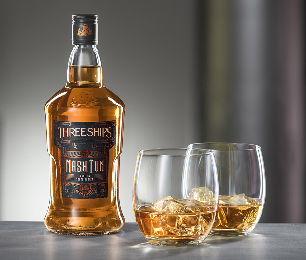
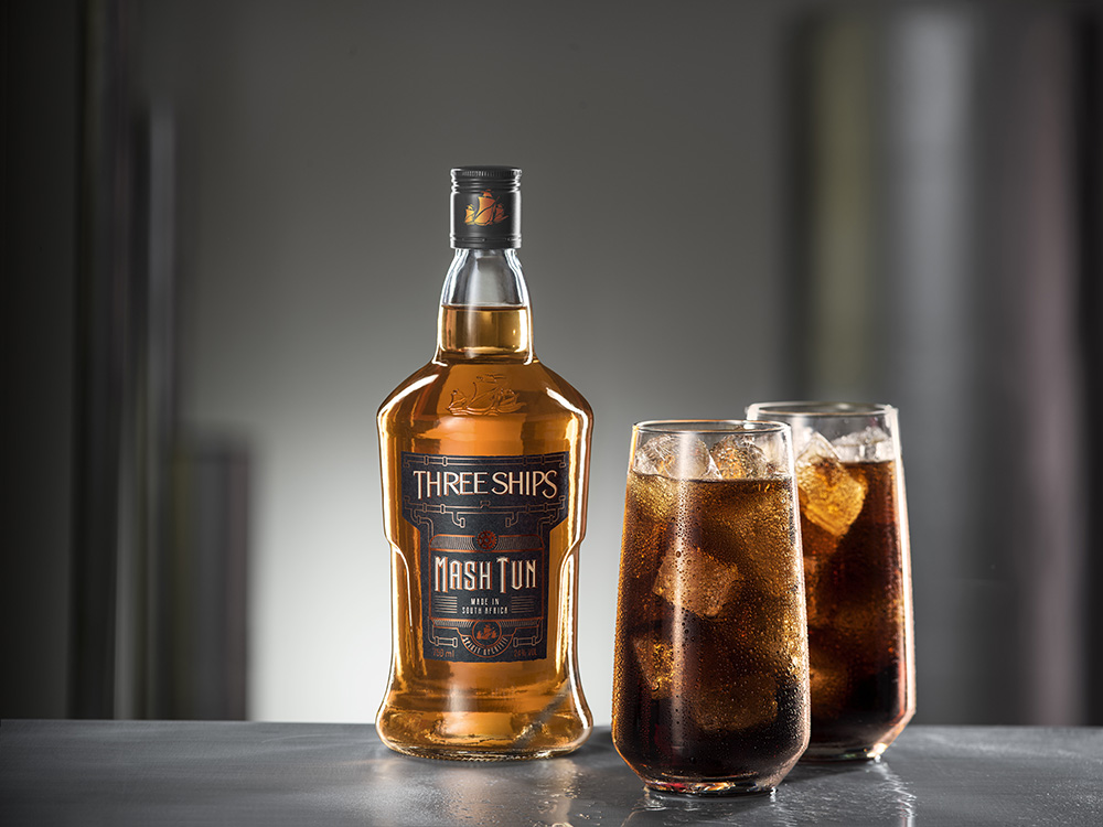
The Mash Tun holds a crucial role in every distillery, where malt, water, and heat harmonise, creating a blend that epitomises the dedication, hard work, and innovative spirit of the James Sedgwick Distillery. However, the Mash Tun itself is not just a whisky—it is a whisky-based spirit aperitif infused with additional flavourants, offering mixability, a lower ABV, and a sweeter profile. This ground-breaking creation aims to attract non-whisky drinkers and introduce them to the world of spirits.
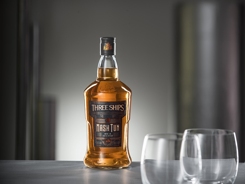
Inspired by the era of steam-powered machinery, Just Design embarked on a journey to craft a label design that exuded a steampunk aesthetic, featuring ornate embellishments of cogs and pipework borders. To elevate the creative vision, they utilised Kurz’s cutting-edge LUXOR®/ALUFIN® MTS 397 copper foil finishes, accentuated against a sleek matte black background, elegantly framing the iconic T-shaped label synonymous with the Three Ships brand. MTS, renowned for its exceptional quality in the graphics industry, not only encompasses a wide range of materials but also boasts high abrasion resistance, a glossy finish, and seamless compatibility with high-speed processing.
Prominently positioned beneath the Three Ships logo, the Mash-Tun wordmark commands attention, while an exquisite lock-up entices curious souls to explore the product further. Proudly supporting local businesses, the label was printed by SA Litho.
The design challenge
The challenge was to launch an entry-level spirit-aperitif to the TSW portfolio, captivating a younger demographic and enticing them to experience a sweeter and more nuanced flavour profile. With a lower ABV than traditional whisky and a focus on mixability, the ultimate aim was to capture the loyalty of long-term whisky drinkers as their palates evolve. To resonate with this vibrant target market, the design needed to transcend the confines of conventional whisky aesthetics and establish a bold personality with an alluring visual language.
Design inspiration
Drawing inspiration from the captivating allure of steam-powered machinery, Just Design embraced its distinctive shapes and forms to craft a one-of-a-kind, funky steampunk ambiance. By incorporating cogs and pipework, they constructed an architectural framework that elegantly enveloped the Three Ships Whisky logo, breathing life into the label.
Design solution
To amplify the creative landscape, they employed copper foil finishes, harmoniously contrasting against a sophisticated matte black backdrop. This visually striking combination artfully accentuated the iconic T-shaped label, an emblematic symbol that defines the Three Ships brand. Taking centre stage beneath the Three Ships logo, the Mash-Tun wordmark commanded attention, while a captivating lock-up encouraged consumers to embark on a journey of discovery.
The result
The result is an arresting and captivating packaging that artfully narrates the story of this extraordinary product. Its unique visual language effortlessly translates across all touchpoints, capturing the attention of both whisky enthusiasts and those venturing into the world of spirits. THREE SHIPS MASH TUN is poised to usher in a new era of whisky-based spirits, enticing a diverse audience with its blend of innovation, sophistication, and irresistible charm.
© Synchron Fabrics & Foils, May 2023
We’re founded on a simple principle; global best products for brand enhancement, underpinned by a depth of technical expertise…
Sarah Sonnenberg, MD Synchron
![]()
Synchron Fabrics & Foils for Brand Enhancement
cs@synchron.co.za • +27 21 527 7100
Accreditation downloads: BBBEE Certificate and ISO 9001