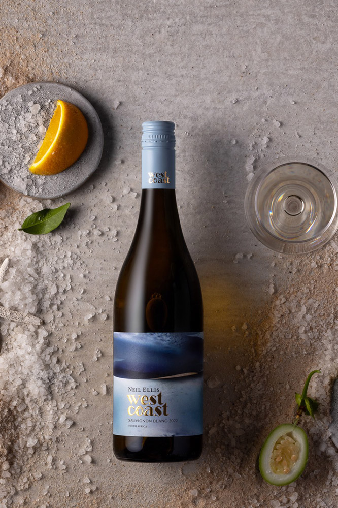
Adamsrib wins major industry award for Neil Ellis West Coast Sauvignon Blanc label
Synchron Markings recently chatted to Anso Cilliers, owner of Adamsrib Creative Solutions, who shared the inside story on the making of their recent Winemag.co.za Label Design Awards Grand Prix winning label. During a Q&A session, she discussed the reason behind the label design.
Q: What was the brief from the client for the design of the label?
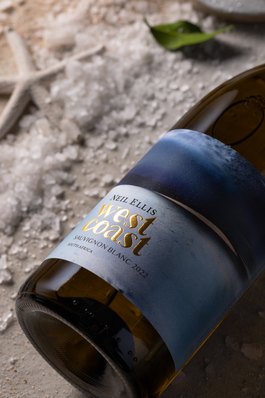
A: The brand owner has a special relationship with the West Coast region, and drew his inspiration for the wine from that deep connection. So we wanted to create a brand that depicts the essence of the West Coast – it’s a landscape of harsh, rugged elements, but also understated beauty and sophistication.
Q: Why did you choose to use that particular format for the design – what is the meaning behind the look and feel?
A: “The illustration is so alive, it almost feels like you are at the West Coast. As if you can taste the salt in the air and feel the sand between your toes (the sand varnish detail enhances this sensation). So I would say the label succeeds in creating an immersive experience for the consumer, before they’ve even tasted the wine!”…
“The interactive element is important, and it creates a sense of relatability, as well as an emotional connection. Therefore we chose to showcase the 12 months in an animated way. If you look at all 12 labels next to each other – you can see the wave moving. This is called variable printing and can be achieved by creating as many backgrounds as you need. Each label also tells the winemaking story, e.g. January: A dry and windy month. Grape ripening in process and summer is in full swing. Interesting details such as these add to the rich narrative.”
Q: Did you use any key label/packaging principles when you designed the label?
A: As designers, we are problem solvers. To solve any problem, one needs information. As much information as you can get from your client, and most importantly, to determine the who and why. If we know who the target market is, and the reason behind the packaging (product), we can start with the solution. We always strive for creative solutions – doing things differently and pushing the boundaries are part of our DNA. Constant, clear communication with our clients is also valuable during the process, and it helps to ensure not only we execute the brief to perfection, but also that we build lasting relationships.
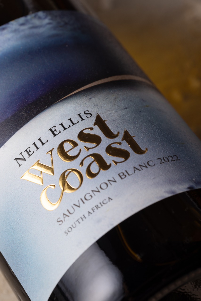
Q: Why did you decide foil needed to be used on the label?
A: All labels need foil! In this case the foil was an essential part of the design. The logo type is in foil and debossing – this created a great contrast against the blue hues of the waves.
Q: What advantages do you believe foiling has on labels?
A: Foil is visual and tactile – the more senses you can engage the better. A brand only has a few seconds to compete against all the other products on the shelf, and consumers are always looking for that something extra that sets a product apart. Foil establishes premium brand positioning and enables premium pricing.
Q: Do you believe foiling stands out on the shelf?
A: Foiling brings printing to life – giving designers more possibilities to work with. The more possibilities we have, the better the end result will be.
Q: Do you know why the KURZ foiling in particular was chosen and can you explain the advantages?
A: We prefer to use KURZ foiling on all packaging designs as the product is recommended by our printers. The product is great and the service is amazing. In the case of this label, it adds a real touch of accessible luxury – coming back to the theme of understated sophistication that is so central to the brand. Kurz also has a clear sustainability strategy that most brands appreciate. It is an advantage for any brand to know that their labels are 100% recyclable and deinkable. KURZ foils allow your brand to boast a classy gloss, without sacrificing any of its sustainability characteristics.
© Synchron Fabrics & Foils, February 2023
It’s simple really. The better the packaging the better the perceived value. KURZ foils provides our brand with a direct route to the “buying brain” – and it shows on the bottom line…
![]()
Synchron Fabrics & Foils for Brand Enhancement
cs@synchron.co.za • +27 21 527 7100
Accreditation downloads: BBBEE Certificate and ISO 9001