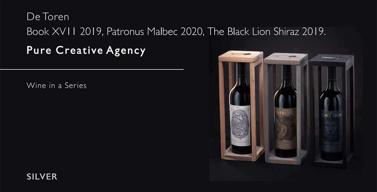
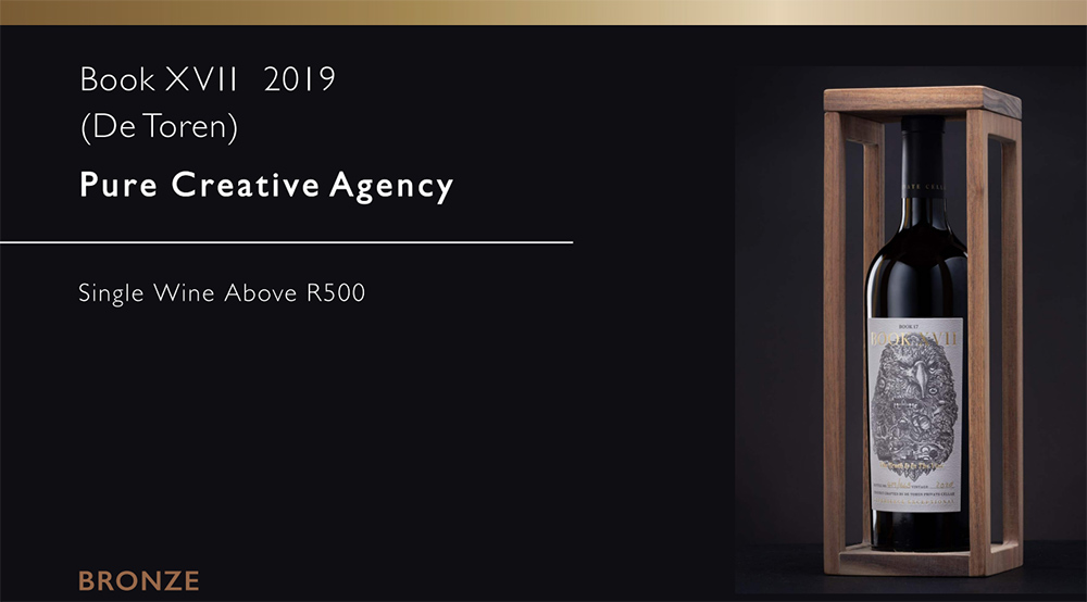
Pure Creative takes Silver and Bronze in 2022 Label Design Awards
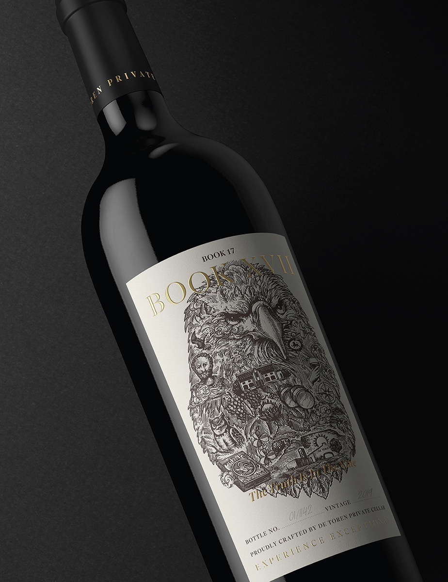
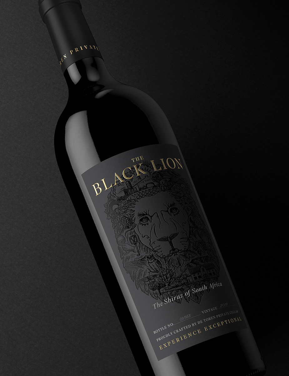
The eighth annual Wine Label Design Awards, the fifth annual Beer Label Design Awards and the third Spirits Label Design Awards took place on 1 December 2022. Pure Creative was awarded Silver in the Wine Series category for the De Toren series, which includes Book XVII 2019, Patronus Malbec 2020, and The Black Lion Shiraz 2019. They were also awarded Bronze for a Single Wine Above R500 for the De Toren Book XVII 2019.
The awards were proudly sponsored by self-adhesive label supplier Rotolabel and are convened by Winemag.co.za. Synchron Markings, Avery Dennison and Kemtek HP Indigo were secondary sponsors. The motivation for the competition is to reward outstanding design as an influence on wine, beer and spirit purchases and all South African wine, beer and spirit producers as well as design studios were invited to enter.
The Judging
- Wines were judged in four categories: 1) under R80 a bottle; 2) over R80 a bottle; 3) over R500 a bottle and 4) labels forming a series – no price constraints.
- Beers were judged in two categories: 1) single labels and 2) labels forming a series.
- Spirits were judged in two categories: 1) single labels and 2) labels forming a series.
Judging criteria include originality of concept, execution, shelf appeal and effectiveness as a piece of communication.
Wine, beer and spirits have to be produced in South Africa and be commercially available.
Pure Creative design agency shines at LDA 2022
Pure Creative is an experienced branding and creative agency based in Cape Town, but also work globally. They take design beyond the computer screen, applying it to diverse areas such as logo identity and branding, design and packaging.
Synchron chatted to Andrew Burke from Pure Creative about the reasons behind the design of these particular wine labels. Andrew explains that the brief from client for the design of the label was to elevate the existing brand from premium to ultra-luxury. He goes on to explain that by highlighting each distinctive component that makes the wine world-class, they hoped to demonstrate the richness of the wine.
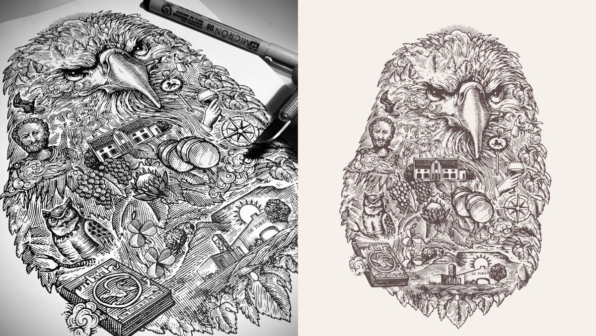
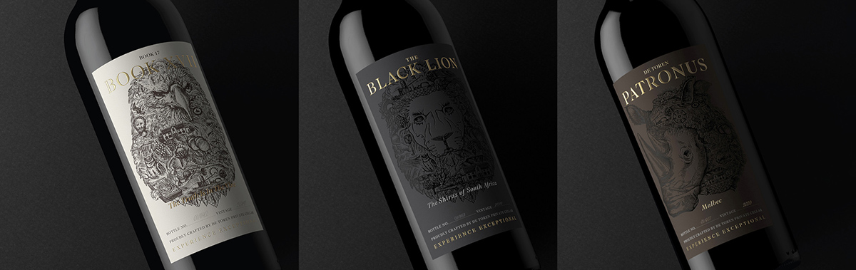
Each varietal has varied elements affecting the production and quality of the wine, from the wind direction to the ancient terroir, direction of the vineyards to the craft. The elements were illustrated as an individual icon and collaged to form the animal face. Black Lion uses a portrait of a lion inspired by the ancient Cape Lion, Book XVII the image of an eagle from the Book XVII. Each animal portrait hand illustrated using the vintage process of etching, which created a unique aesthetic you cannot achieve in photoshop.
When asked if they had used any key label or packaging principles when designing the label, Andrew reiterated that this had been achieved by having the focus on the visual of the label and keeping the brand identity and logo understated so as to give into the complexity of each illustration.
Deciding if foil should be on the label, was an easy decision as the agency has known and partnered with Synchron on innovative brand designs since 2001. The use of luxury foiling and embossing truly elevates the labels and well as the products.
We asked Andrew what advantages he believes foiling has on labels, and his answer truly reflects why this can be a necessity rather than a nice to have. “Foiling adds the element of elegance required to elevate the product to one of luxury. It grabs the consumers attention and highlights important elements of the label from a design standpoint. Using foil for decorative labelling enhances the visual impact, shelf-appeal, improves brand status and makes a product stand out on shelf from the competition. Without foiling, a high-end print production would fall flat. Research has shown that packaging decorated with foil rates around 80% higher than non-foil packaging/labels in quality, appeal, value and brand awareness.”
KURZ foiling advantages
KURZ foiling was chosen for this exceptional project. Andrew highlights some advantages that this particular foiling has. “Besides the extensive KURZ colour range and quality which is simply superior on every level to their competitors, KURZ in partnership with Synchron have the answer to the challenges of the industry. Being a worldwide leader in the thin film technology industry, KURZ continues to introduce more and more innovative projects that fall in line with the global discussion around sustainability. From a local standpoint, Synchron has made an incredible mark in the attractive and functional surface decoration space – by setting new standards and ensuring the local market is on the same level as their global counterparts.”
For more information on this type of foiling for labels and packaging, please contact Synchron Markings on cs@synchron.co.za.
© Synchron Fabrics & Foils, January 2023
We’re founded on a simple principle; global best products for brand enhancement, underpinned by a depth of technical expertise…
Sarah Sonnenberg, MD Synchron
![]()
Synchron Fabrics & Foils for Brand Enhancement
cs@synchron.co.za • +27 21 527 7100
Accreditation downloads: BBBEE Certificate and ISO 9001